
Dark Mode Theming in Grommet - Part 1: How to set up and apply a theme
December 15, 2023
This post is Part 1 of a three-part series.
- Part 1 - How to set up and apply a theme
- Part 2 - Adding dark and light theme modes
- Part 3 - Theme color customization
As a UI/UX developer at HPE, I use Grommet extensively. I am also a regular contributor on the Grommet Slack channels where the Theming capabilities, especially Grommet’s support for light and dark modes, are a consistent topic of interest.
Grommet has robust support for light and dark themes. Due to the apparent interest in this topic, I thought I’d share my approach on how to get started with theme mode styling in Grommet.
To illustrate the method I use, I’m going to create a simple application demonstrating the ability to toggle between light and dark modes. By the end of this 3-part blog series, I will have demonstrated how to:
- Apply a theme in a Grommet application
- Incorporate dark and light theme modes
- Modify a theme to apply custom colors in dark and light modes
The final product will be a simple application with a custom theme applied and the ability for a user to toggle between the app’s light and dark modes.
Setup for the tutorial
Prerequisites
This tutorial assumes familiarity with HTML, JavaScript, and React. However, even if any of these are new to you, you should be able to follow along and complete the exercise.
Get the Starter Code
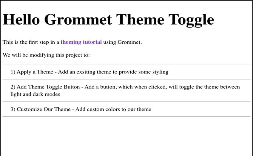
Open this starting code in your browser. Create your own copy by clicking 'Fork' from the menu in the upper right corner. The starter app will look like this:
Starter Code Orientation
Development Environment
For this tutorial, I’m using Codesandbox as the development environment. Codesandbox presents the user with:
- An interface for the project’s file and directory structure
- A text editor for editing files
- A browser window to view and interact with the application
Project Structure and Dependencies
The project structure mimics a minimal Create React App (CRA) structure and is organized like so:
/public
- index.html (this gets loaded by the browser and is what renders src/index.js)
/src
- index.js (This is the project’s root file. I won’t be modifying it.)
- App.js
- DemoSection.js (This is a component I will use later in the tutorial)
Package.json (Create React App ships with
react,react-dom, andreact-scriptsas dependencies. Additionally, I’ve addedgrommetand its peer dependency,styled-components, to the starter project.)
App.js
For this tutorial, most of the development will happen in App.js. The App.js file consists of three parts; imports, projectTasks array, and the App component.
Import of React and Grommet components:
import React from "react";
import { Grommet, Anchor, Box, List, Heading, Paragraph, Text } from "grommet";
projectTasks array with the tasks to be implemented
const projectTasks = [
 "Apply a Theme - Add an existing theme to provide some styling",
 `Add Theme Toggle Button - Add a button, which when clicked,
 will toggle the theme between light and dark modes`,
 "Customize Theme - Add custom colors to theme"
];
The App is composed of the following Grommet components:
<Grommet>is the top level Grommet container<Box>for some basic page layout- For the page’s content, I have
<Heading>,< Paragraph>, and<List>which iterates over theprojectTasksarray, returning a<Text>component for each task.
const App = () => {
 return (
   <Grommet full>
     <Box gap="small" pad="large" align="start">
       <Heading level="1">Hello Grommet Theme Toggle</Heading>
       <Paragraph>
         This is the first step in a <Anchor href="#">theming tutorial</Anchor>{" "}
         using Grommet.
       </Paragraph>
       <Paragraph>We will be modifying this project to:</Paragraph>
       <List data={projectTasks}>
         {(task, index) => (
           <Text key={index}>
             {index + 1}) {task}
           </Text>
         )}
       </List>
     </Box>
   </Grommet>
 );
};

export default App;
Applying a Theme
To provide some initial styling, I’ll apply the grommet theme. In Part 3 of this series, I will show you how to customize and incorporate a custom theme.
In App.js, import and apply the Grommet theme:
Import grommet theme
import { grommet } from "grommet";
Apply it by adding theme={grommet} to the Grommet component.
<Grommet full theme={grommet}>


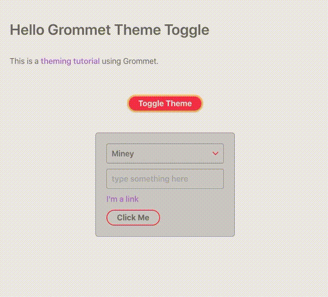
Your code and resulting app should resemble this Codesandbox, and the app’s UI should have updated with the applied theme.
At this point, you now have an understanding for how to apply a theme to a Grommet app. This is the foundation from which we will build custom theming. In my next post, I will show you how to add dark/light theming and give users control over toggling between theme modes. In my final post, I will wrap up with a how to customize a theme with custom dark and light mode colors.
Stay tuned to the HPE DEV blog to catch Parts 2 and 3 of this series. If you have any questions, please feel free to reach out to me and others in the Grommet group on our Slack channel.
Related
Contributors enhance Grommet during Hacktoberfest
Oct 28, 2019
Dark Mode Theming in Grommet - Part 2: Adding dark and light theme modes
Dec 15, 2023
Dark Mode Theming in Grommet - Part 3: Theme color customization
Dec 15, 2023How to Register a Grommet OSB Broker in a Kubernetes Service Catalog
Aug 21, 2019Meet Eric Soderberg and Shimrit Yacobi - HPE DEV Team Members working on Grommet
Feb 7, 2020
Meet Open Source Grommet Expert, Shimrit Yacobi
Sep 22, 2022New Grommet release offers new components and improves accessibility
Oct 8, 2020